Quick Links
Is it effortless to reach every page on your site from your main menu, or is your navigation a cluttered mess? Can you view your site on a mobile device, or do the dimensions immediately appear out of whack?
These are critical questions to ask because 88% of online consumers are less likely to return to a site after a difficult-to-use or bad experience. Additionally, you won’t be able to dominate the search rankings without an airtight UX design and user interface.
So, if your SEO strategy doesn’t incorporate a winning UX design, you likely won’t get very far.
Why is that?
Google (and other search engines) have come a long way since the keyword-stuffing days of old. In the early days of SEO, keyword density was the primary ranking factor, which led to the heavy use of keyword spam.
Now, Google looks at 200+ ranking signals, and the quality of your UX design is one of the most important. Because UX is an umbrella term that includes site speed, mobile friendliness, site navigation, and site architecture, we’ve put together this extensive guide for UX SEO. Here, you’ll learn more about how to include the top UX-related SEO ranking signals in your website.
How Does UX Affect Your SEO Rankings?
When search engines first started to emerge on the internet, their algorithms were quite simple. They ranked how many times a search query appeared in a website’s content. The engines gave little to no credence to the quality of the content, its trustworthiness, or the quality of its website design/customer experience.
That all began to change when Google emerged on the scene because they had one goal in mind: to match user search intent with the highest quality results. Google’s founders Larry Page and Sergey Brin even devised the idea of using backlinks to rank content (as a way to measure trustworthiness) while they were still at Stanford.
As the years went by, more and more ranking factors entered the mix.
UX ranking signals
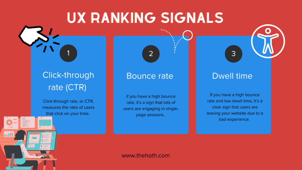
Today, Google’s algorithm (and other search engine algorithms) pays special attention to crucial metrics to determine the quality of your UX design.
These metrics include:
- Click-through rate (CTR)
- Bounce rate
- Dwell time
If you have a high bounce rate and low dwell time, it’s a clear sign that users are leaving your website due to a bad experience. It could be that your loading speed is too slow, the layout is too confusing, or it could be due to a number of other UX-related issues.
Google also has its Core Web Vitals test that its crawlers run on every website in its index. This test determines page speed, which falls under the UX umbrella.
As you can see, your UX affects your SEO efforts. To ensure that you don’t get buried too far down on the search engine results pages (SERPs), you’ll need to follow some SEO best practices related to UX design.
UX SEO: How To Create a Winning Design That Ranks High
Now that you know how crucial your UX design is to your SEO efforts, let’s learn how to build a design that your users will love.
To see the best results in your business, UX and SEO go hand-in-hand. You can think about it like this:
- SEO tactics cater to search engine algorithms and crawlers to rank higher on search engines like Google and Bing.
- UX design tactics cater to the end users that will interact with your site and potentially make a purchase.
Therefore, you need an SEO strategy that will rank your content in one of the top spots on the SERPs to increase visibility with your target audience. You also need a stellar UX design to keep users on your page while guiding them down your sales funnel. As you can see, your SEO strategy and UX design are linked because they work in tandem to generate leads and sales for your business.
Next, let’s learn about the top factors affecting your UX.
Headers
If you want a blog post or product page to provide a positive experience, you need to use headings to break up the text properly. There’s a reason why print media such as newspapers have used large, bold headers for countless decades—it’s because they grab attention.
Using H1, H2, and H3 headings in your content makes it effortless for searchers to quickly scan your article to determine if it’s worth reading. Headers also make web pages easier to read because they summarize what large chunks of the text are about, creating a logical hierarchy (i.e., starting with the main topic and embellishing it and introducing subtopics).
Headings also matter for SEO, as web crawlers scan them to determine what your content is about. As such, if you format your headings in an SEO-friendly way, you have a better chance of ranking higher. But, if you aren’t consistent (e.g., if you use more than one H1), you may confuse Google’s crawlers, which isn’t what you want.
Here are some pointers for formatting headings in a way that both users and crawlers respond to:
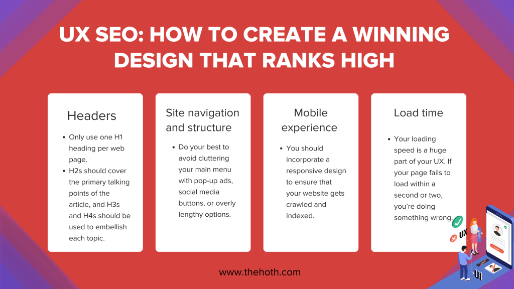
- Only use one H1 heading per web page: This will help determine the primary focus of your content (i.e., an H1 titled ‘How to Groom Your Dog’ is clearly about dog grooming).
- H2s should cover the primary talking points of the article, and H3s and H4s should be used to embellish each topic.
Following this formula will help you build web pages with a positive UX.
Site navigation and structure
How easy your website is to navigate is another significant component of your UX. If most organic traffic visits your site from search engines, they likely won’t land on your homepage. Instead, they’ll probably reach one of your blogs or product pages instead.
This means users will need a way to navigate to the rest of your website from there, so your structure needs to be on point.
Can users reach any page on your site from the main menu/navigation bar?
If so, you probably have orphan pages (web pages that have no internal links pointing at them), which isn’t good for your SEO profile.
Do your best to avoid cluttering your main menu with pop-up ads, social media buttons, or overly lengthy options. Your best bet is to include a clear, logical navigation bar, laid out in a user-friendly way that includes all the pages on your website.
The last thing you want is for your visitors to spend too much time trying to find out how to get to one of your product pages; that will likely lead to a bounce.
Mobile experience
Google now practices mobile-first indexing, which means it will first crawl and index your site’s mobile version.
Why did they do this?
Google made this change because mobile users are now more prevalent than desktop users. As of 2022, 53.74% of all web visits were on mobile devices (only 46.26% came from desktops).
You should incorporate a responsive design to ensure that your website gets crawled and indexed. This is where you only use one version of your website that works for both desktop and mobile by switching its dimensions depending on the user’s device.
Load time
We mentioned earlier that Google’s Core Web Vitals test will determine the page speed and load time of your website.
As such, your loading speed is a huge part of your UX. If your page fails to load within a second or two, you’re doing something wrong.
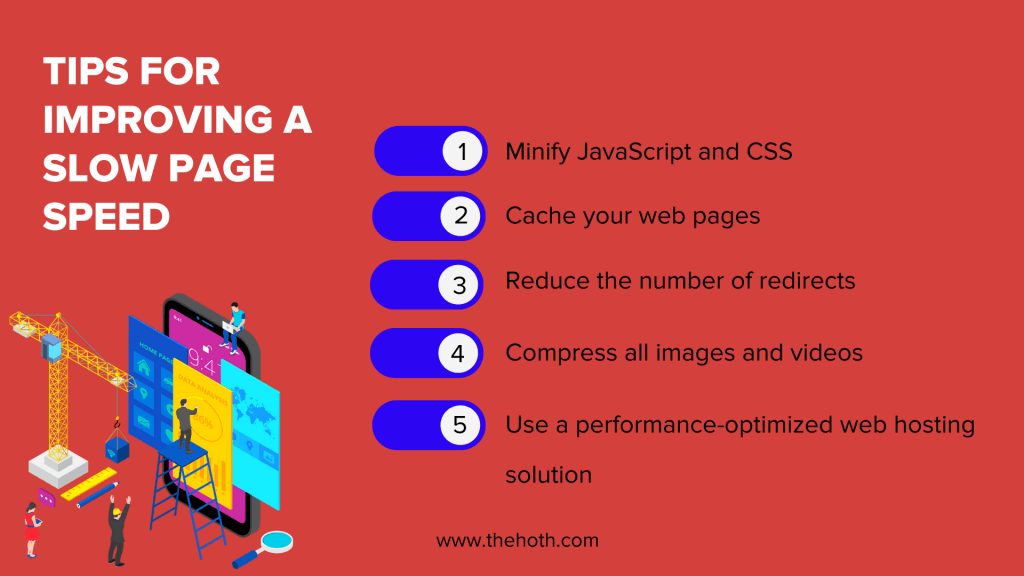
Here are some quick tips for improving a slow page speed:
- Minify JavaScript and CSS wherever possible
- Cache your web pages
- Reduce the number of redirects
- Compress all images and videos
- Use a performance-optimized web hosting solution
If you aren’t sure how fast your website loads, you can use Google’s PageSpeed Insights tool to find out.
Concluding Thoughts: UX SEO
By now, you should better understand how UX design and SEO work together, not only to generate more traffic but also to boost your conversion rates.
SEO will bring prospective users to your site, and your UX design will help turn them into paying customers (if you have well-written content with clear and convincing CTAs).
Do you need professional help with your SEO strategy?
If so, don’t wait to check out our five-star managed SEO services at HOTH X. Our team of SEO experts is also available for consulting, so feel free to schedule a call today.


Really important information about coming up dates.
Thanks for this info!
I can totally understand why Google is doing this as I personally find pop ups on mobile – wellmyes – very annoying. So good on Google !
Can google penalize for social lockers WordPress plugin?
No, why would they do that? The social locker has nothing to do with popups.
Very good initiative by Google. Forget marketing and promotion, its very annoying to see too many popups while visiting any site. In reality it is downgrading the user experience.
And worth mentioning, this post is very informative and very well written. Thanks for sharing.
I completely agree with you. It is really irritating to see too many popups. Great approach by Google.
Does this include pop ups triggered by an intent to leave? That sort of pop up (in theory) is there after content is consumed.
I would suggest just getting rid of all popups on mobile.
Pop-ups resemble that desperate car salesmen, stalking you the minute they see you drive up the lot. Such a deterrent for a good user experience. Give people a chance to read your content and don’t do such hard sell.
Great information. but you didn’t mentioned about Latest google Fred update in march 2017. Major Low Quality content penalized . However Google has not confirmed this update
https://www.thehoth.com/blog/google-fred-update/
Mobile real estate is at a premium. Anything getting in the way could be bad for the experience.
Ive been trying to grasp fully what EEAT update means. Thanks for this, i appreciate.
Your blog post makes a compelling case for the close connection between SEO and UX design. The integration of SEO and UX design is crucial for attracting and retaining users, ultimately leading to higher conversion rates. Pretty good blog. Thanks.